Notts County Programme Gallery
Covering the latter half of the 20th century
Left - A Notts home programme from 1957/58, this design had not
really changed since pre-war days and continued until 1961.
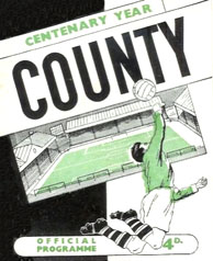
Right - Finally a change (and a splash of green) to mark the "Centenary
year" (season 1961/62),
note that the covers do not provide any clue as to who the opponents
are, which
competition it is or when the match is being played.
Left - a cover design first seen on the special centenary match
programme of May 2nd 1962 when County played an England XI.
This pocket sized design was then adopted for the next 3 seasons.
The Coat of Arms badge was also introduced to County's shirts during
centenary year.
From the start of 1965/66 a new larger programme was introduced with
a black & green cover, the cover also saw the inclusion of "Stylish
Magpie" -
the cartoon Magpie had first been seen in a slightly different pose
(mid-stride
& carrying the ball) in 1933 on a card series depicting club nicknames.
In 1966/67
Notts made the radical decision to introduce a newspaper style programme
-
Although it only lasted for one season, the format would be revived
ten years later.
Pictured right is the design used for all Notts programmes from the
beginning of
1967/68
through to the end of the 4th Division Championship season of 1970/71
.
Click on the programme covers below for the corresponding season's stats page.
1971/72 & 1972/73
The programme cover would now change with each new season,
yet - content wise - the early-mid 1970's productions were still
very similar in style to those of the 1960's.
1973/74 & 1974/75
The 1974/75 programme introduced the minimalist flying magpie motif,
but this would not be seen on Notts shirts for another 3 years.
1975/76 & 1976/77
1975/76 saw the return of the newspaper programme, these boasted much
more to read but trying to look through them on a packed terrace without
getting them sodden in a down-pour must have been a nightmare.
1977/78 & 1978/79
From one extreme to another.
The tiny late 1970's efforts are a total embarrassment, even at the
time they must
have been dismissed as something you would expect to find at a non-league
ground, they were certainly not up to old 2nd Division standard.
1979/80 & 1980/81
At first glance the rectangular 1979/80 programme might have been viewed
as an attractive
novelty, but it was really no better than the previous term. 1980/81
was larger and had a splash of
colour but was equally shoddy, hardly worthy of a promotion winning
season..
1981/82 & 1982/83
At last, a colour photograph, but only on the cover. The new programme
for the top
flight was an improvement but still rather embarrassing compared to
the productions
that Notts fans were picking up on their travels.
For 1982/83 an illustration was used for the cover until it became widely
known that
the drawing was in fact based upon a photograph of our rivals over
the Trent.
In January 1983 the cover was changed to a yellow and black design
with
a colour picture of Brian Kilcline v Everton See
it here.
1983/84 & 1984/85
County's programme for the last of the treble season stint in the top
flight was a
meatier affair but still rather poorly designed & printed.
Ironically the 1984/85 rectangle programme, which co-incided with a
successive
relegation, was well up to the expected standard, this was without
question County's
best production up to that time and despite the drop to lower league
level -
Notts continued to issue good quality programmes for the next 3 seasons.
This was also the first programme to include some colour photographs
inside the
publication, but most colour pages at this stage were reserved for
advertisers.
1985/86 & 1986/87
Smaller pocket sized programmes for the 5 season stay in the 3rd tier,
personally I much prefer this sized programme to the folded A4ish sized
designs that
have now become standard. A full colour, full page pic of each player
was now appearing
in every issue and the thumbnail mug shots/kit sponsors page also began.
1987/88 & 1988/89
1987/88 was another decent effort, but the lack of colour
inside the magazine was now becoming an issue.
1988/89 was notable for an increase in colour and then, due to a cost
cutting exercise
mid-way through the season, the complete lack of it (even on the cover!!!).
The Blackpool programme (pictured) was the final colour edition produced
that season although happily this one included the first Manager's
programme notes to be
written by Neil Warnock. Content-wise it was a starker effort compared
to recent
years and with the total loss of colour it became another embarrassment.
1989/90 & 1990/91
1989/90 was a much more interesting programme for it included more
to read and a
number of pages had coloured backgrounds. It was a bright effort and
this would probably
be my 2nd favourite Notts programme design of all. A different black
& white action shot
adorned each cover (replacing the standard practice of changing cover
pics every so often)
and the colour team photo appeared on every issue. The Play Off Semi-Final
edition marked
the end of the pocket sized era as Notts progressed to bigger and better
things.
For the return to what is now 'Championship' level in 1990/91, the dimensions
increased
to what is roughly a folded A4 (and this size has been employed ever
since). This season also
marked a milestone in County programme history, the price had now reached
£1.
1991/92 & 1992/93
Top flight again for 1991/92 but a disappointing programme compared
to what many other clubs were offering as Notts narrowly missed out
on the
opportunity to print bona-fide "Premiership" programmes the following
season.
1992/93's effort was just about acceptable in the wake of demotion back
down to
"Championship" level, as too was the final day position that avoided
another relegation, the
programme v Sunderland (for that unforgettable end-of-season match)
is illustrated right.
1993/94 & 1994/95
1993/94 is, for me, the best Notts programme design of all time, it's
aesthetically pleasing from front cover to back and has a nice glossy
feel to it.
The only thing that was missing from "The Mag" (as was the case with
almost all
Notts programmes until the late 1990's) was the lack of the opponents
emblem.
The following season saw the Notts programme settle down into a less
striking but
satisfactory format which was basically to last (interior wise) for
the next three season's.
1995/96 & 1996/97
Less colourful efforts with pale lifeless pastel background shades
illustrated what was to be Notts fade from the luminous light of success
into the cold mist of lower league football.
1997/98 & 1998/99
Sam Allardyce's record breaking basement league promotion season was
accompanied by a refreshing youthful looking design and the
opponents badge was now making a welcome appearance on the
back page of each issue.
1998/99, although quite stark in appearance, remains an attractive bold
design,
not least for its' uniformity and the healthy use of club emblems.
With the last
issue of 1998/99 we said goodbye to the 1-11 "Today's Teams" page (with
the line-ups
predicted in advance), it was to be a full list of fixed squad numbers
from now on.
1999/00 & 2000/01
Another decent effort was used to straddle the millennium before the
ensuing chaos
of the Scardino/Administration era was reflected in the programmes
of the next four
seasons, the magazines from this period struggled to settle down into
any kind of
format - often completely changing their look mid-season (and for me
that's the ultimate
sin in football programme production).
2001/02 & 2002/03
Pictured left is the attractive and imaginative look of the "Great
Escape" period,
this scan being of the final day issue for the memorable match v Huddersfield.
But this design only came into being in the January of that season
and it gave way to
a poorer effort the following term.
2002/03, as with virtually all Notts programmes since the millennium,
was not short on content but rather lacking in originality.
Sorry, we do not have any programmes for sale.
Thanks to Richard Hucknall who produced an
excellent
guidebook on Notts County programmes in 1999.
Last updated February 2008